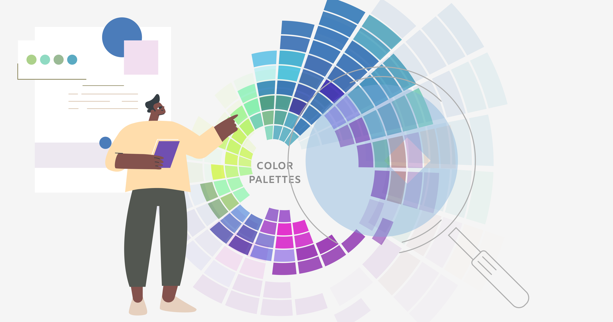
Colors play a crucial role in website design, not just by enhancing visual appeal but also by significantly influencing user emotions and behavior. Understanding color psychology allows you to create websites that are both attention-grabbing and effective.
How do colors affect emotions and influence behavior?
Colors have a profound impact on both the emotions and behavior of users. Different colors evoke specific emotions, for example:
- Red: energy, excitement, urgency.
- Blue: calmness, trust, reliability.
- Yellow: happiness, optimism.
- Green: harmony, connection to nature.
In addition to affecting emotions, colors also influence user behavior. For example, red prompts action and attracts attention, making it effective for call-to-action buttons, while blue encourages relaxation and fosters trust. Yellow is useful for highlighting important elements, and green creates a sense of safety and stability. Thoughtfully selected colors can guide user behavior and improve site effectiveness.
The importance of context and culture.
Color perception varies across cultures, making it essential to consider the global audience. For example:
- White: purity and innocence in Western cultures, mourning in some Asian cultures.
- Red: luck and celebration in China, danger in Western cultures. These cultural differences are crucial to consider when designing websites for a diverse audience.
Color palettes and branding.
Color plays a vital role in building brand identity. Famous examples include Coca-Cola’s use of red for energy and excitement, and Facebook’s use of blue for trust and connection. Your color palette should be carefully selected to evoke the right associations and ensure brand recognition. Consistent use of the same colors across your website, logo, and products helps create a cohesive and memorable brand image. Choosing complementary colors also helps maintain visual harmony.
Color perception in mobile apps.
Colors may appear differently on various devices due to screen variations and lighting conditions. This is important to consider when designing to ensure a consistent and pleasant visual experience across all platforms.
The role of neutral colors.
Neutral colors like gray, white, and black are essential in web design, providing background and highlighting key elements. These colors help create balance within your color palette and can be used to achieve a clean and minimalist design.
How can we use color psychology in web design?
When selecting a color scheme for your site, it’s important to consider your target audience and the website’s goals. For example, a site selling sports products might benefit from dynamic reds and blacks, which are associated with energy and strength. In contrast, a medical clinic website might use calming blues and greens to evoke trust and comfort. Avoid overusing bright colors, as they can overwhelm the user and make the site difficult to navigate.
To summarise, color psychology plays a significant role in web design, influencing user decisions and interactions with your site. By understanding these principles and applying them effectively, you can create a website that meets both your business goals and the needs of your users. Now is the time to apply this knowledge and make your designs stand out.
Our team is ready to assist you in creating visually appealing and effective websites that resonate with your audience.

