When creating a website, it’s essential to pay attention to every part of it, as each component is important and can impact conversion rates. However, during development, proper attention is not always given to the footer. Neglecting the footer is often based on the assumption that users rarely visit it, but we believe this assumption is incorrect.
When users scroll to the end of a webpage, they expect to find valuable information, the possibility to request a callback, links to social media pages, and more. Therefore, the absence of a footer or an unstructured footer with poor design and content can raise additional questions for users, leaving unpleasant impressions and a sense of incompleteness.
What is a footer, and why is it important?
The footer is the bottom block of a webpage where additional useful information for users is placed. A well-designed footer can increase the convenience of using the site, improve SEO, and attract customer attention.
Therefore, special attention should be paid to its development.
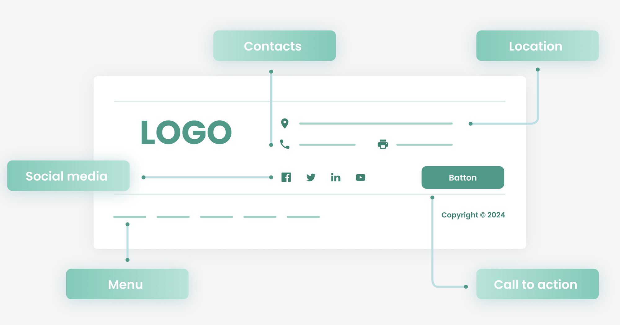
Essential Elements for a User-Friendly Footer:
- Contact Information.
If you value your users, their inquiries, or are open to cooperation, always leave your contact information. - Navigation Links.
They help users quickly find the pages they need, such as “Services” and “Contacts”. - Social Media Links.
An easy method to increase the reach of your social media pages without additional promotion costs. - Copyright Notice.
A way to protect your site from being copied. Although the copyright notice can be placed anywhere, it is most often placed in the footer.
This list can be expanded based on your website’s specific needs; these are just the basic elements that should be present in the footer to make your site accessible.
Designing an Effective Footer
- Clarity and Structure.
The content in the footer should be structured and divided into clear sections for quick comprehension. It should be easy to read, not overloaded with information, and display correctly on mobile devices, as many users will view the mobile version of the site. - Headings.
Make the headings short and clear. - Call to Action.
Adding a call to action, such as subscribing to newsletters or visiting social media, is a good idea. - Visual Appeal.
To attract attention, you can add animations, which play on human emotions and subconsciously encourage action. - Colour Scheme and Fonts.
Colours should be harmonious but contrasting for easier reading. Fonts need to be easy to read, not too small but not too large either.
There are many nuances in styling the footer, so it’s worth trying different options to find the best one for your site. It’s crucial to monitor the relevance of the information in the footer and update it in a timely manner so that users do not get lost and all the possibilities of your site are realized.
The footer is not just a small detail, but an element of the website that plays a significant role in its effectiveness. A properly developed footer with thoughtful design, competent structure, and necessary content will be a source of various benefits and help in achieving business goals.
We hope these tips will be useful to you, regardless of your business specifics and target audience.

